

I’ve recently trained some teachers in the rules I use for posters, infographics, and slides. Given that I produced a poster about my guidelines during the session, I thought I may as well share them here. We looked at ensuring slides etc have the most impact and the desired response. Studnets in all schools see so many slides and posters around the place that it can easily start blurring together. As the look of everything can be limited to a small number of default templates that appear first in the apps, teachers good intentions then get hampered by overlapping in the visual memory of the learners. I offered 4 decisions that keep each product more unique.
Decision 1: Layout – Less is more
I consider how many key items I’m dealing with. In this case I had 4 key guidelines so considered :
- how a page/slide might be divided in four.
- What layouts have I not seen recently – you don’t want to many things in your classroom or school looking the same.
- Is the target of the work more informative or creative. I keep layout simpler if it’s main aim in information.
- I decided we had not seen a basic cheque board look recently and the aim of this poster was information., so we kept it simple.
- Too much information on one page / slide can overload the viewer and fight against the intentions of the creator.
Decision 2: Style – Pick one and stick to it.
If the style remains constant it is easier to digest the info. Saying that, you can use style to emphasise or unite key elements. E.g. I use yellow to highlight the key word from each of the 4 guidelines on the poster above.
- If you import icons for objects:
- try to use a icon sets so they’re all the same style
- , match their line and shape style for other objects
- If you start with a photo, use it’s colours for other objects
- For colours,

- use 3 max (unless doing an actual rainbow effect) + Black and white.
- Use either a vertical or horizontal line on the colour pallet – match tone or single colour theme
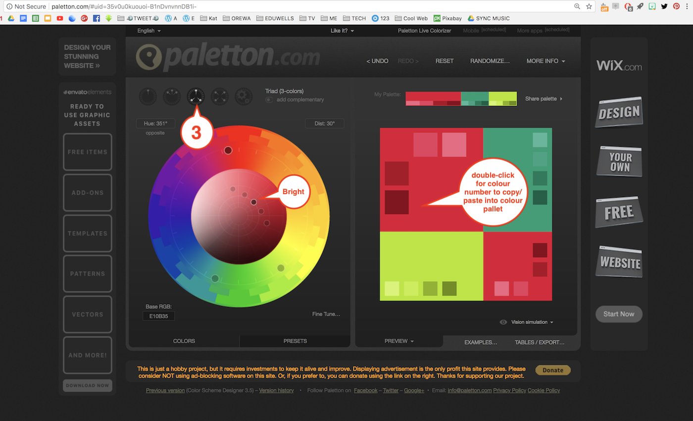
- OR use Paletton.com for a 3 colour designer pallet. (see Pic)
- Stick to one line style and width
- Don’t go crazy with fonts – try to stick to one and make sure it’s easy on the eye
- For slides, keep to the same colour theme and style. A change of colour or style can accidentally visually imply a change of topic.
Decision 3: Balance objects size and spacing
No matter what’s on the page, make sure all the objects, when grouped, create an equal border width around the edge.
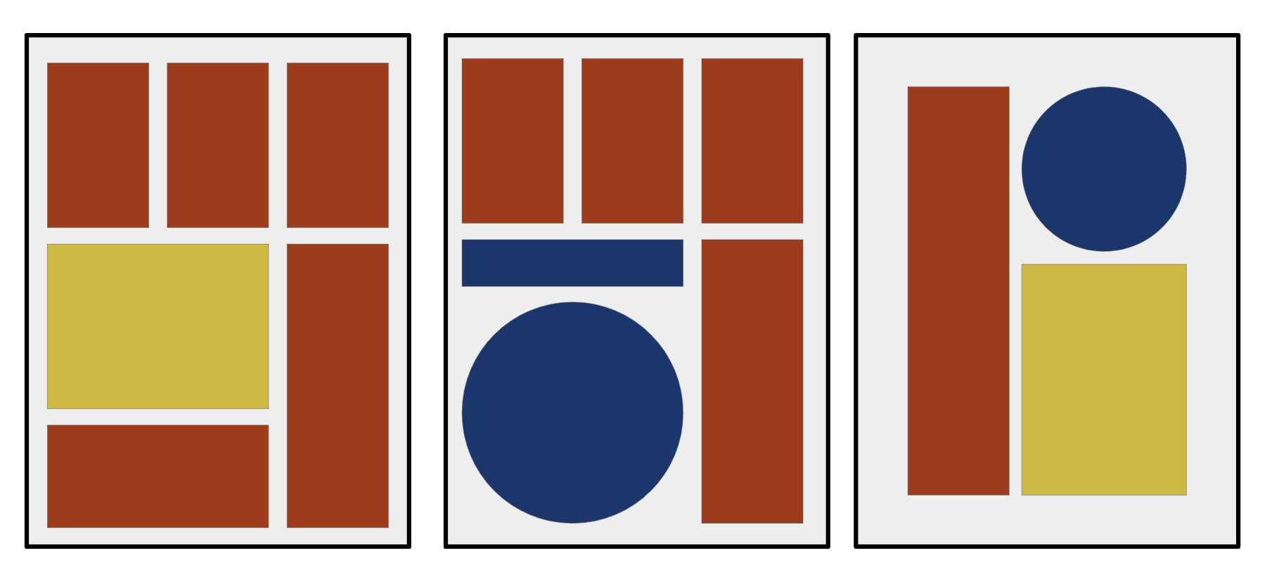
- Don’t use bullets if colour and shapes can divide the info.
- Consider how many key statements/elements there are and find an interesting way to divide the area up in a balanced way.
- Remember people read left-to-right and top-to-bottom. Think about the order you want people to see things in.
Decision 4 – Quality and thematic images
 Using high-quality images is key to making work look professional. When people can quickly recognise their work looks like quality product, teachers and students both enjoy the task much more. Speakers can be taken more seriously if they look visually professional.
- Use a good royalty-free image site. Not Google.
- I use pixabay.com (There are many more)
- Have a creative thought about connecting the meaning of images with your theme. This cocktail on a beach might mean relax or holiday but it also might mean “escape” or “lonely”.
- Try to match the colours of your graphic to the images you chose. This will help maintain the 3+B&W colour rule.
There you go. My final rule is “Be inspired by others.” Google “posters” and “infographics” before you start any project and try to copy the ideas of pros. You’ll rarely achieve the same result leaving you with wonderfully unique “ideas of you own.”
Extra video advice. How to make and NOT make a powerpoint:
