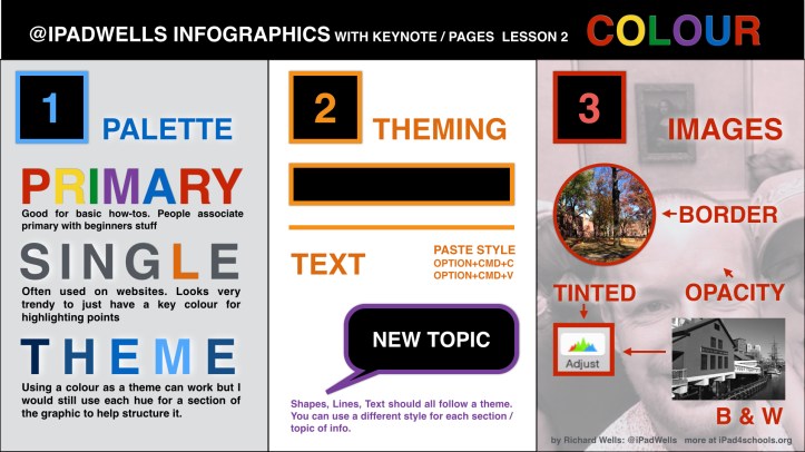
COLOUR: This lesson covers dealing with colour and sticking to colour themes and working with images within your colour theme. I find colour a fascinating topic as we are all effected by it far more than we think. Advertisers are using colour everyday to not only grab your attention but control what you think about things. When trying to take a reader through a topic within one of my infographics, I am very aware of how colour will effect what they look at first and the importance their eyes will place on each element.
Below is my 2nd “How to make an @iPadwells infographic” video lesson. These can all be found in their own playlist.
Music by Kaitain.
Topics covered:
- Palette
- Theme
- Keynote shortcuts
- Images – Tinting
- images – as a starting pint for colour theme.
Here’s the summary slide. Hope you find some of it useful.

